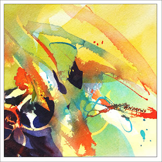
Here is a second small abstract in steps.
As with my previous image, I just tossed some liquid acrylics on the paper and manipulated some marks with my applicator bottle and a brush..
Things changed as I began to use some geometry in the image.
To block out certain areas, I used acrylic white ink, watered down. This gave my eyes some respite from the bright colors.I particularly did this in the lower right corner. After it dried, I completely changed my palette of colors to a cooler spectrum.
The darks are VERY important in these abstract designs. They help ANCHOR the eye and BALANCE the image.
In some areas I took out my original whites, and enhanced those areas with glazes of lime yellow watercolor.
I always leave a lot of whites in my first throw ins if I can, that way I have the option of getting rid of them if need be as the painting progresses.
I hope you are enjoying these challenging little abstracts.
I am...:)))


